NBAP — Digging Deeper logo over the podcast hosts

Brand Design · Identity · Social Media

New Brunswick Archaeology Podcast

Digging Deeper

Client
New Brunswick Archaeology Podcast
Scope
Brand Design, Identity, Social Media, Merch
Year
2026 Ongoing
Links
Spotify · LinkedIn

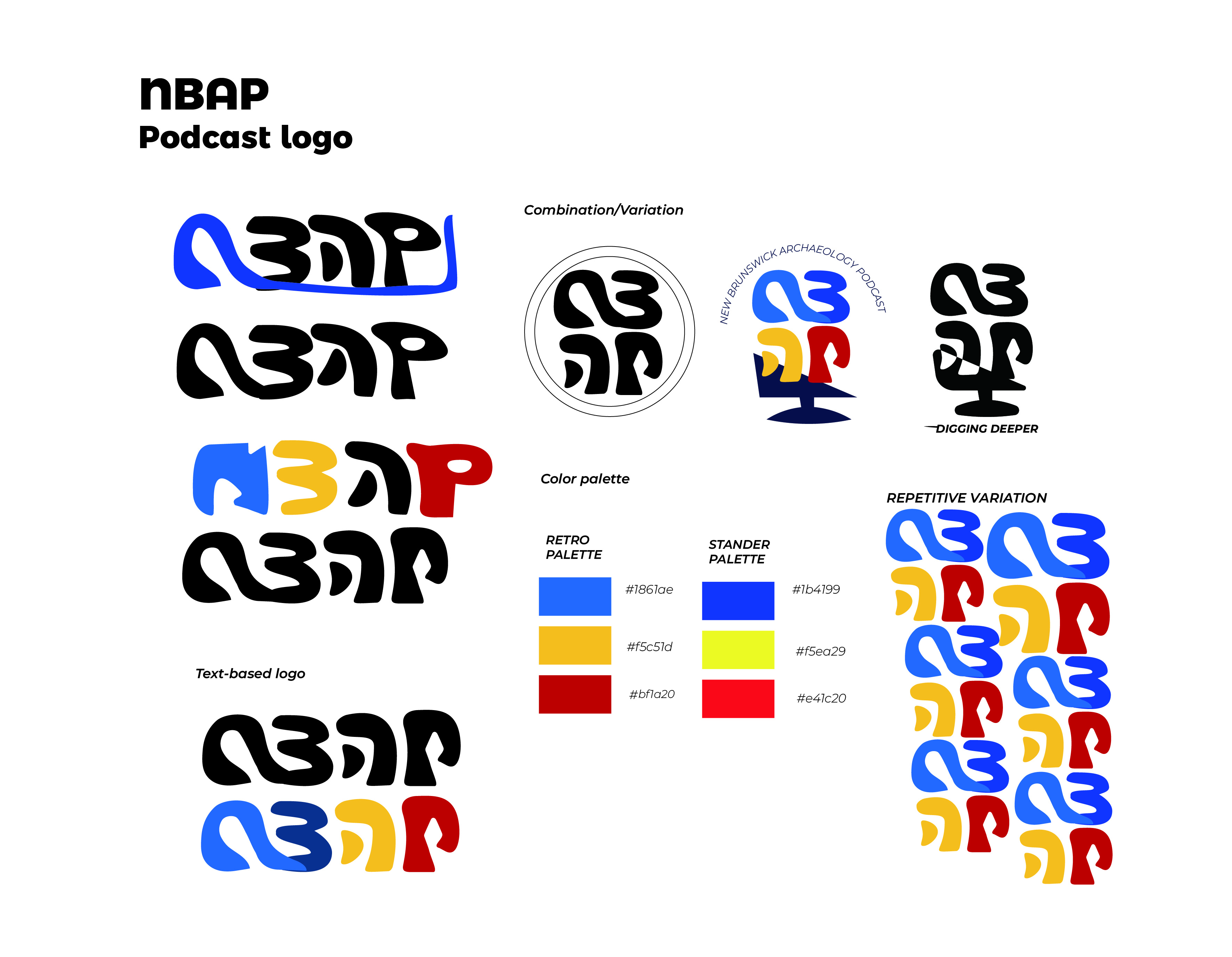
The NBAP logo began with the idea that archaeology is not simply about finding objects, but about assembling fragments into meaning. This became the conceptual basis for redesigning the acronym NBAP into a series of modular, artifact-like letterforms that could be rearranged, interpreted, and layered.

Rather than starting with conventional typography, the letters were treated as shapes with material presence — carved, bent, and eroded forms that evoke pottery shards, carved symbols, or stratigraphic contours. Early explorations incorporated a microphone stand to reference the podcast medium. As the concept developed, the form shifted from a literal mic to a more abstract configuration that still hints at excavation tools, surveying stands, and stratigraphic layers.

Color played a key role. A territorial palette inspired by the New Brunswick flag grounds the brand in provincial culture, while a secondary retro palette references archival material and educational heritage — linking archaeology's past-focused approach with the podcast's contemporary storytelling mission.